Trading 212 will reverse its controversial portfolio redesign next month after users flooded the company's forums and social media with complaints about the new interface, marking a rare retreat for the UK-based broker.
Trading 212 Scraps Portfolio Redesign After User Revolt
The company rolled out the redesign around mid-December, introducing a bubble-style layout that sparked immediate backlash from retail investors who said the changes buried critical information and made the app harder to navigate. Within 10 days, Trading 212 announced it would restore the previous version.
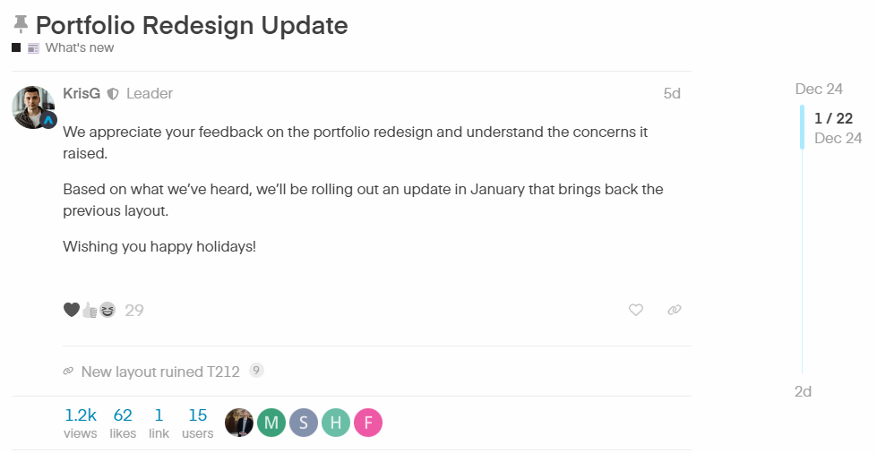
“We appreciate your feedback on the portfolio redesign and understand the concerns it raised,” KrisG, a Trading 212 representative, wrote in the company's community forum on December 24. “Based on what we've heard, we'll be rolling out an update in January that brings back the previous layout.”
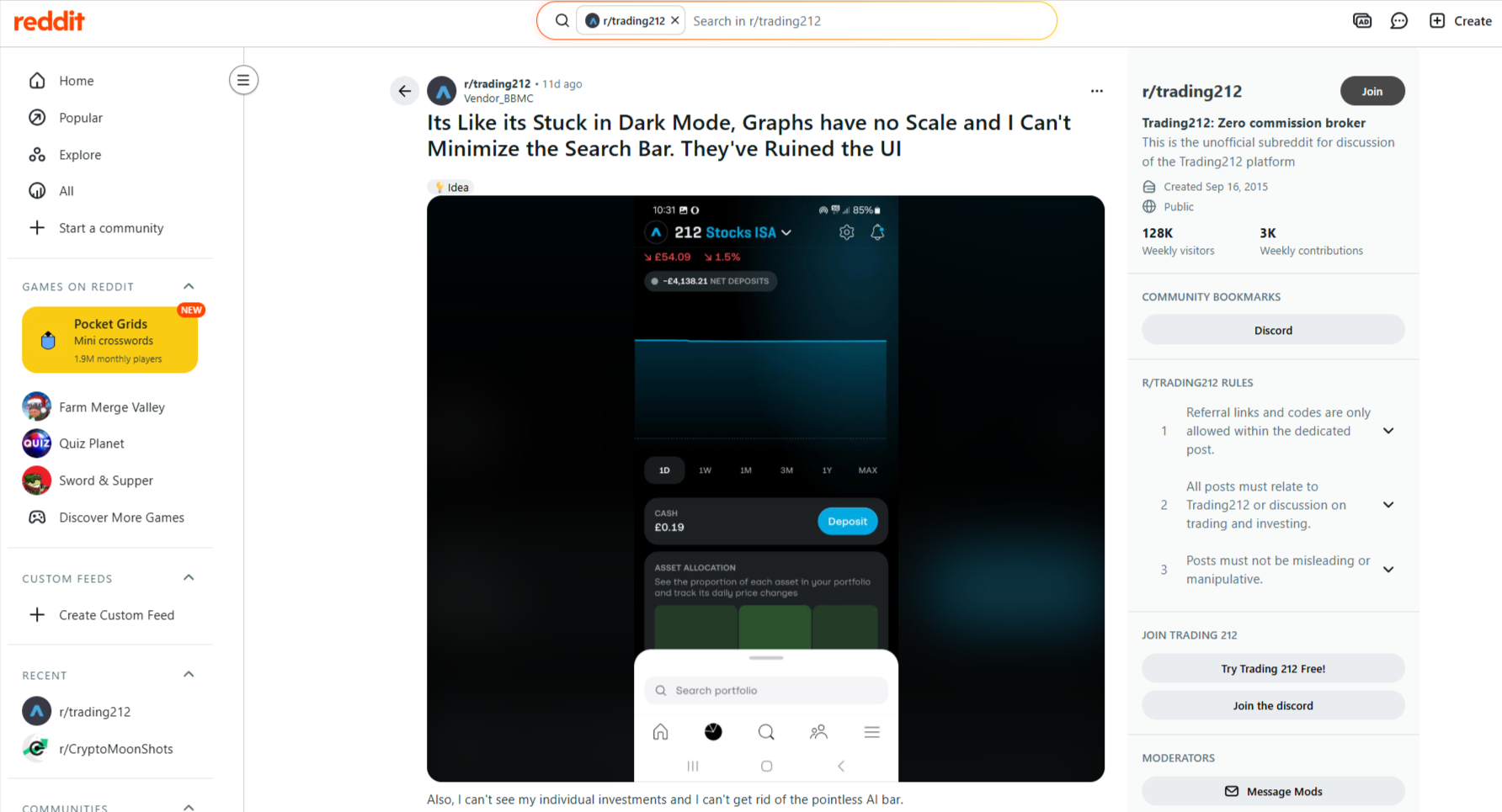
Reddit user Vendor_BBMC posted a screenshot from the mobile app showing what the “Portfolio” tab looks like after the changes. Unfortunately, FinanceMagnates.com did not find a screenshot of the earlier version for comparison.
In the meantime, the company’s former COO launched a fractional shares and commission-free trading app for retail traders, combining Investing.one and MyInsider.app.
Bubble Design Drew Fire Over Screen Space
The new design replaced a straightforward list view with rounded cards and pull-up menus that users said wasted screen space and required extra taps to access basic information. Portfolio holdings were hidden behind a search bar instead of appearing immediately when users opened the app.
“Why is information split into multiple bubble-style windows?” wrote user Minmax77 on December 14 in a post that received 65 likes. “The borders, padding, and background gaps take up more room than the actual content. Instead of a clean, compact layout, everything is spread out into small ‘islands’ of information surrounded by empty space.”

Users singled out specific functionality losses. The portfolio value graph removed axis numbers, pending orders no longer showed cash allocation amounts, and the interface stopped respecting user color theme preferences. One user created an account solely to complain, choosing the username “IHateTheNewLayout.”
“The app feels completely unserious. Who creates charts without a Y-axis?” wrote user NakamuraRTS on December 16. “People are using your app to deploy their life savings. Do better in 2026.”
Traders Threaten Platform Switch
Multiple users said the changes prompted them to explore rival brokers, a threat that appears to have caught Trading 212's attention. The complaints spread beyond the company's official forum to Reddit and app store reviews, where users posted negative feedback threads.
- Trading 212 Launches Crypto Trading under Its Cyprus Unit
- Trading212 Cyprus Doubles Its 2024 Revenue to £42 Million
- Trading 212 Taps Former Revolut Exec Christos Drakos to Lead Crypto Operations
“This new designe is terrible. It is really dealbreaker for me and Iam thinking about switching to another broker,” user Anibohovi wrote on December 15.
User Vladel captured the frustration on December 17, writing: “Honestly I can't imagine anyone thinking this was a good idea. Why are 212 intentionally making it harder to find information? Now going from home to portfolio I can't now instantly see all the information I could before, why would you do that?? It's like you're intentionally trying to anger your users.”
Another user who goes by mbaat said Trading 212 support initially dismissed the concerns. “I have contacted support yesterday and they said that this was a business decision and that there are no plans of reverting the changes,” mbaat wrote on December 18. Days later, the company announced the reversal.
Company Acknowledges Design Missteps
Trading 212 team members began responding to complaints on December 16, acknowledging the problems.
“We're actively reviewing all the feedback we've received and have already identified a few areas that need improvement based on your comments,” wrote Bogi.H, another company representative.
By December 19, the company pushed minor fixes, including restoring the ability to tap pending orders to open instrument pages. But the changes didn't satisfy users demanding a complete rollback.
The reversal announcement on December 24 drew relief from most users, though some defended the modern aesthetic. User saifali argued Trading 212 should offer both layouts. calling them “Modern” and “Legacy” versions – to allow continued innovation while preserving user choice.
“There will always be a group of people who will not like the new design, that's just how it is, but design evolves and so does the taste of people,” saifali wrote on December 25.
Pattern Of Interface Complaints
The December redesign wasn't Trading 212's first brush with user interface backlash. Earlier in 2025, the company made changes to its home screen that moved watchlists into pull-up tabs, drawing similar complaints about reduced functionality.
Several users called for Trading 212 to establish a beta testing program with community members before rolling out major interface changes.
“Push out changes first to a beta branch with limited participation and collect feedback, make the necessary improvements before rolling this out to everyone,” user cosmic90 suggested on December 17.
Trading 212 hasn't specified exactly when in January the rollback will occur or whether it will implement user testing for future updates.